The significance of an effective Product Listing Page (PLP) cannot be overstated. The virtual storefront, encapsulated within confines of a webpage, serves as the gateway to a plethora of products, each vying for attention and consideration.
As consumers increasingly turn to online shopping, the importance of optimizing the product listing page cannot be overstated. It is here that the delicate dance of design, functionality, and user experience unfolds, influencing purchasing decisions and shaping the overall perception of your brand.
Join us as we navigate the intricacies of product listing page optimization, offering insights into the psychology of online shoppers and practical strategies to enhance visibility, engagement, and ultimately, drive conversions.
Optimizing filters for seamless navigation
The first cardinal rule in optimizing product listing pages revolves around the strategic placement and functionality of filters. Filters serve as the linchpin for users attempting to navigate the expansive realm of products, enabling them to pinpoint their desired items with precision.
To enhance user experience, it is imperative to prioritize filter prominence by sorting them based on popularity, ensuring that the most frequently used attributes are readily accessible. Furthermore, in the era of mobile dominance, the stickiness of filters during page scrolls is paramount, providing users with uninterrupted access to refine their search criteria.
Not only should filters be easily visible, but they should also display the number of products corresponding to selected attributes, providing users with valuable insights into the breadth of their potential selections.
Additionally, the convenience of clearing all selected attributes at once adds an extra layer of user-friendliness, allowing for effortless exploration and refining of product options.
In essence, prioritizing the visibility, accessibility, and functionality of filters contributes a cornerstone in creating a product listing page that is intuitive, engaging, and adept at converting casual browsers into satisfied customers.

Crafting compelling product pods - design and functionality
A critical facet in the art of crafting compelling product listing pages lies in the thoughtful design of product pods. These digital showcases play a pivotal role in guiding users towards informed purchasing decisions as they navigate through an array of product options.
To ensure seamless and engaging user experience, certain best practices come to the forefront.
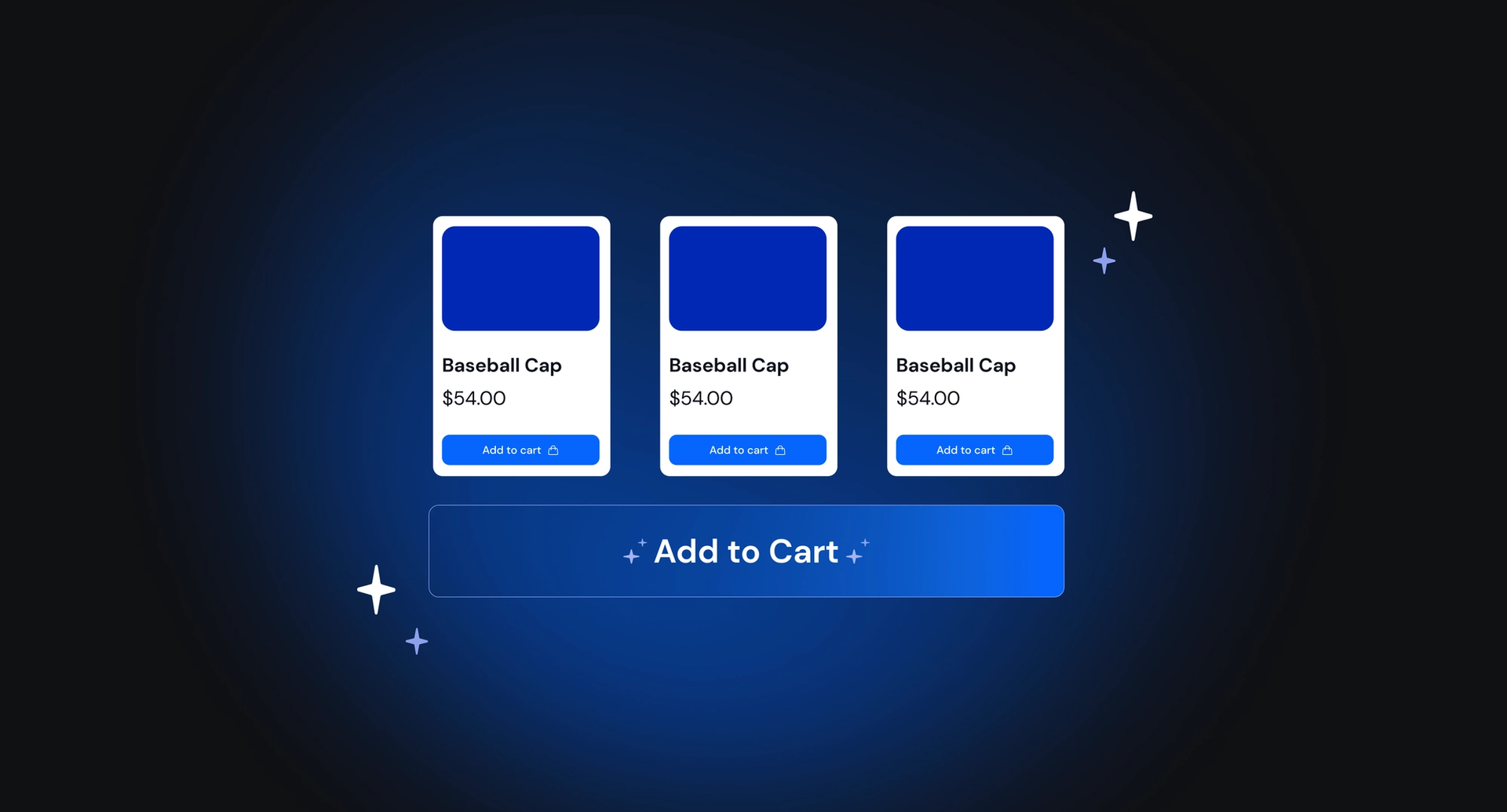
On desktop devices, the availability of secondary images on hover offers a dynamic preview, granting users a closer look at the product from different angles. The inclusion of a swift “Add to Cart” option caters to impulsive buyers, streamlining the purchasing process.
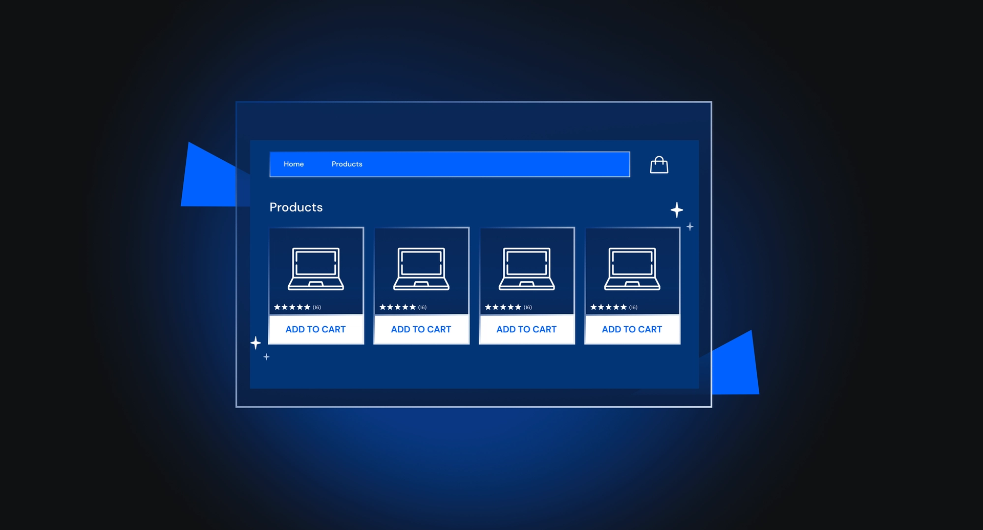
Diversifying the CTA palette with secondary options such as Wishlist or Compare enhances user interactivity and facilitates personalized shopping journeys. Displaying product ratings provides valuable social proof, instilling confidence in potential buyers. Clear emphasis on discount prices through visual cues ensures that users swiftly recognize and appreciate cost savings.
Harmonizing UX and SEO
In the intricate dance of digital commerce, harmonizing user experience (UX) and search engine optimization (SEO) within the layout of product listing pages is a paramount best practice. A judicious fusion of these elements not only ensures a seamless journey for users but also enhances the discoverability of your products.
To appease the SEO deities, incorporating essential elements like a well-crafted title, breadcrumbs, and an additional product category description becomes imperative, fortifying your page's visibility in search engine results. Implementing pagination or a "Load more" feature at the page's conclusion facilitates a smoother user experience, allowing visitors to explore a myriad of products without overwhelming them with a single, extensive scroll.
To provide users with a comprehensive understanding of the product landscape, prominently displaying the total number of products on the page at the outset serves as a navigational compass, enabling informed exploration.
In essence, a meticulously curated layout that intertwines UX and SEO considerations becomes the compass guiding users through an online retail realm that is not only aesthetically pleasing but also strategically aligned with the intricacies of digital discoverability.

Emerging trends - enriching the user experience
Embracing the ever-evolving landscape of e-commerce, recent trends in product listing pages have emerged, enriching the user experience and elevating online shopping to new heights.
Faux product pods:
- Virtual placeholders used for advertising other product categories, conveying messages, or providing additional category descriptions.
- Enhances engagement and storytelling on the product listing page.
Product category boxes at the top:
- Visual showcase of different product categories or types at the page's outset.
- Educates users about product variations, inspiring exploration and expanding possibilities.
Browsable product photos in product pods:
- Allows users to browse all available product photos directly within product pods on the listing page.
- Streamlines the browsing experience, eliminating the need to visit individual product details pages for additional images.
- Quick, convenient, and contributes to an overall improved user experience.
Tailoring best practices
In conclusion, the best practices outlined for optimizing product listing pages serve as a versatile guide, adaptable to diverse industries and target audiences. Recognizing that the efficacy of these recommendations may vary based on factors such as industry nuances and the preferences of the target demographic is essential.
For instance, while displaying product ratings in product pods may be indispensable for higher-priced and complex items like computers, its relevance in the context of apparel products might be less pronounced.
These practices are not one-size-fits-all; rather, they offer a foundation that can be tailored to align with specific business goals, target audiences, and brand guidelines.
Navigating the nuances of product listing page optimization requires a thoughtful blend of industry insights, user-centric design, and a keen understanding of the unique facets that define a brand. By considering these elements in tandem, businesses can craft product listing pages that not only meet the expectations of their diverse customer base but also contribute to the overarching success of their e-commerce endeavors.


